Column Chart
A column chart displays data as a set of vertical bars grouped by category. It is useful for illustrating comparisons among items.
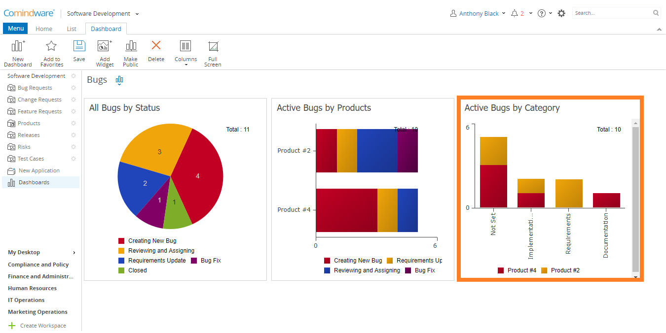
Column chart
To create a Column chart:
1. Select a dashboard in the Navigation pane.
2. Click the «Add Widget» button in the Ribbon.
3. Choose the «Column Chart» widget type.
4. Select a list that will be used as the data source for your widget.
5. Complete the required fields as shown in the table below:
| Field | Description |
|---|---|
| Widget Name | Widget name will be displayed as a title for the widget in the dashboard. |
| Data Source | A list of tasks or items used as a data source for this widget. |
| Group By: 1 | Choose a field in which you want to combine data into a single sector. |
| Group By: 2 | Choose a field in which you want to combine data into a single sector. |
| Stacked | Columns will be placed on top of each other to make a single column. |
| Data Grouping inside Sector | Choose how to group the data in the sector. The following values are available:
|
6. When finished, click the «Finish» button. The widget will be added to your dashboard.